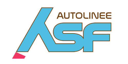
The new ASF Autolinee logo has been unveiled, capturing the identity of the Como area and driving the company towards increasingly ambitious branding goals. The 'ASF' lettering, as blue as the lake's water, is framed by a brown outline representing the surrounding lakeside towns that benefit daily from ASF's services. Beneath the 'A', a red geometric element symbolises the city of Como, the beating heart of the region and a gateway for thousands of tourists every year.The strategic restyling — delivered by Be Content Communication — was presented by the Chairman of ASF Autolinee, Guido Martinelli, and the Chief Executive Officer, Massimo Bertazzoli, who wished to refresh the company's image one year after taking office, following the innovations and revolutions that defined 2024.ASF Autolinee is actively engaged in a transformation process that balances established services, innovation, and environmental respect to successfully tackle the challenges of the green and digital transition.